Enhancing eplus:
Improving User Experience for a Japanese Ticketing Platform
Project Overview
-
✺ Objective
My goal of the eplus website redesign was to improve the user experience for Japanese ticket purchasers. By identifying key usability issues and creating user-friendly design solutions, the goal was to streamline the ticket purchasing process and improve overall user satisfaction.
-
✺ My Role
In this project, I conducted user testing to uncover pain points, identified usability challenges, and developed wireframes and prototypes based on the findings. I synthesized recommendations and worked closely with stakeholders to ensure the design addressed user needs effectively.
-
✺ Outcome
The redesign resulted in a more intuitive, streamlined user experience, improving navigation and usability. User feedback post-redesign showed increased satisfaction with the website, and key usability metrics such as task completion time and error rates improved.
Background
eplus is a popular Japanese ticketing platform that allows users to purchase tickets for events such as concerts, theater performances, and sporting events.
Despite its widespread use, many users found the website difficult to navigate, with a complicated ticket-purchasing process and unclear pathways for finding information.
To address these issues, a redesign is needed to make the website more intuitive, improve overall usability, and better align with user expectations.
User Testing
To comprehensively understand user interactions with the existing eplus website, a series of user tests were conducted.
The objective was to gain insights into the usability and effectiveness of the current website design, identify pain points, and determine areas for improvement.
Meet the Participants
-

Participant A
A regular user of eplus attending a diverse range of events. Familiar with the current interface but has expressed occasional frustrations.
-

Participant B
An infrequent user, primarily interested in sports events. Has experienced challenges in finding specific events in the past.
-

Participant C
A first-time user of eplus, unfamiliar with the platform's layout and features.
Methodology
The user tests were structured as a combination of task-based scenarios and open-ended exploration. This provided an opportunity to observe how users naturally navigate and interact with the current eplus website.
Key Findings
Event Discovery:
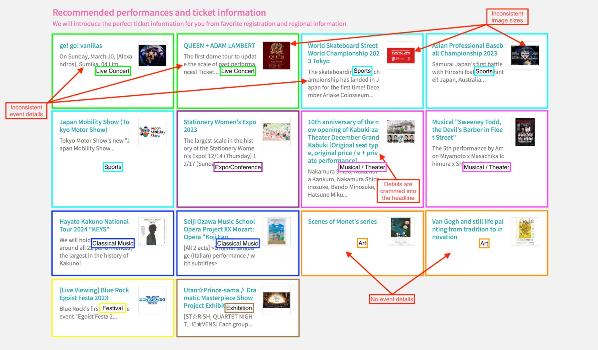
Participants struggled with inconsistent event card formats, making it challenging to quickly discern key information about events.
Navigation:
The navigation structure received mixed feedback. While some participants were able to find specific events, others encountered difficulties.
Ticket Purchasing Process:
The multi-step ticket purchasing process was a common pain point. Participants expressed the need for clearer instructions, especially regarding the lottery system.
Now, let’s take a closer look at the key findings from each stage of the project.
Event Discovery
Background
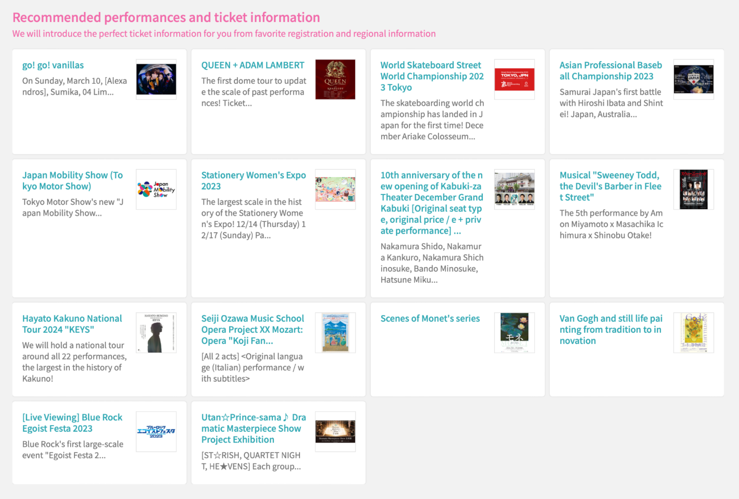
The eplus homepage features event cards that display key information such as titles, descriptions, and occasionally "kaomoji" (Japanese keyboard emojis). While these cards help organize events in a structured manner, inconsistencies in formatting and content density create a cluttered and overwhelming visual experience.
Problem
Event cards on eplus vary in terms of headlines, descriptions, and image sizes, making the browsing experience difficult. Displaying events from multiple categories in one section adds to the information overload, increasing cognitive load as users struggle to quickly identify key details.
According to Hick’s Law, more stimuli lead to longer decision times, further complicating the user journey.
Solution
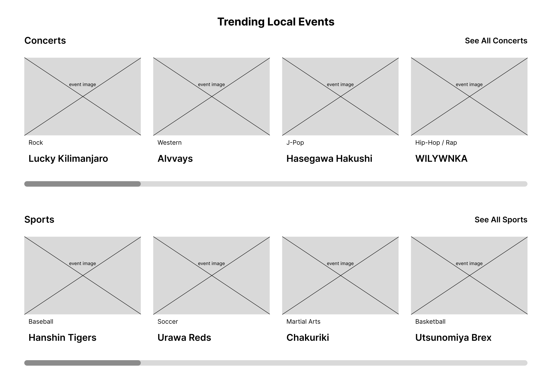
To improve usability, I proposed standardizing event card layouts and organizing events into separate categories for better discovery. The categories serve as a quick indicator for users to filter events based on their interests, reducing decision time.
To address the inconsistencies and overwhelming amount of information on the event cards, I increased visual emphasis on the images and simplified the information display. Images are now the focal point of the event cards, enhancing the overall aesthetic and allowing users to visually engage with teh events first, reducing cognitive overload. Only essential information is shown upfront: Event Genre and Event Name. This minimalist approach ensures clarity and aligns with users’ desire for quick decision-making, as outlined in Hick’s Law.
By streamlining the content and improving visual hierarchy, the user experience becomes more intuitive and efficient.
Navigation
Background
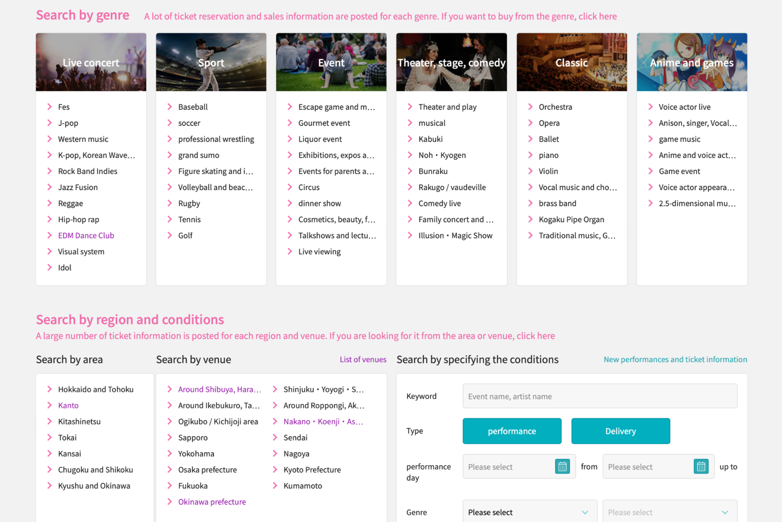
eplus’ navigation is currently facilitated through a top bar that categorizes events by type, with additional search options such as Search by Area, Search by Venue, and Search by Organization. The navigation also includes a "Detailed Genre" button that moves users down the page to more refined search options, which can sometimes cause disorientation.
Problem
The navigation structure presents several challenges:
Overwhelming Search Options: The presence of multiple search buttons clutters the navigation, forcing users to adapt to a rigid structure, which increases cognitive load and hampers exploration.
Confusing Genre Search: The "Detailed Genre" button takes users to a different section of the page without a clear indication, often frustrating those who accidentally click it.
User Frustration: Test participants had mixed experiences, with first-time users especially finding it difficult to locate desired events and genres, opting instead to scroll through content manually.
Solution
To enhance event discovery, I added dropdowns to the top bar which allow users to directly select subcategories without scrolling, offering a cleaner and more intuitive browsing experience. This hierarchical structure adheres to the Gestalt principle of simplicity, guiding users to their desired content effortlessly.
To streamline the navigation experience, I replaced the multiple search buttons with two additional input fields: one for location and another for date, alongside the main search field. These unified search fields reduce clutter and allow users to input multiple criteria (location, date, event category) in a single, simplified action.
Ticket Purchasing Process
Background
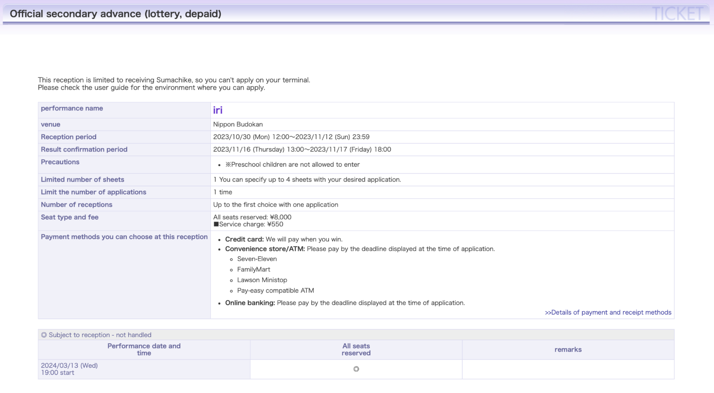
The ticket purchasing process on eplus is divided into multiple steps, including event announcements, reception periods, lottery systems, and ticket purchases. This multi-step process is intended to ensure fair access to popular events but may overwhelm inexperienced users, resulting in drop-offs.
Problem
The current checkout process suffers from:
Complexity and Confusion: Users find the multi-step process, particularly the lottery system, confusing. Lack of clarity around the reception period and the sequence of steps leads to errors and frustrations.
Information Overload: The checkout page presents an overwhelming amount of information in dense, text-heavy blocks with no clear visual hierarchy. This lack of organization makes it difficult for users to understand critical details like ticket types, reception periods, and payment methods, increasing the chance of user errors.
User Frustration: During user testing, participants expressed confusion, particularly regarding the lottery system and different ticket options. While some were familiar with the process through experience, others were left unsure, potentially leading to abandonment during the checkout.
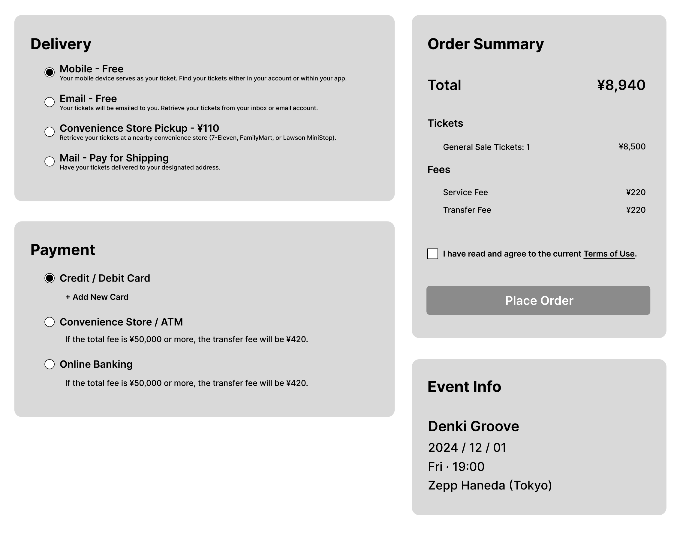
Solution
To streamline the checkout process, I organized the checkout page with distinct headings, subheadings, and contrasting colors to prioritize critical information like ticket types and dates. This helps users quickly scan and digest relevant information, reducing the risk of missing key details.
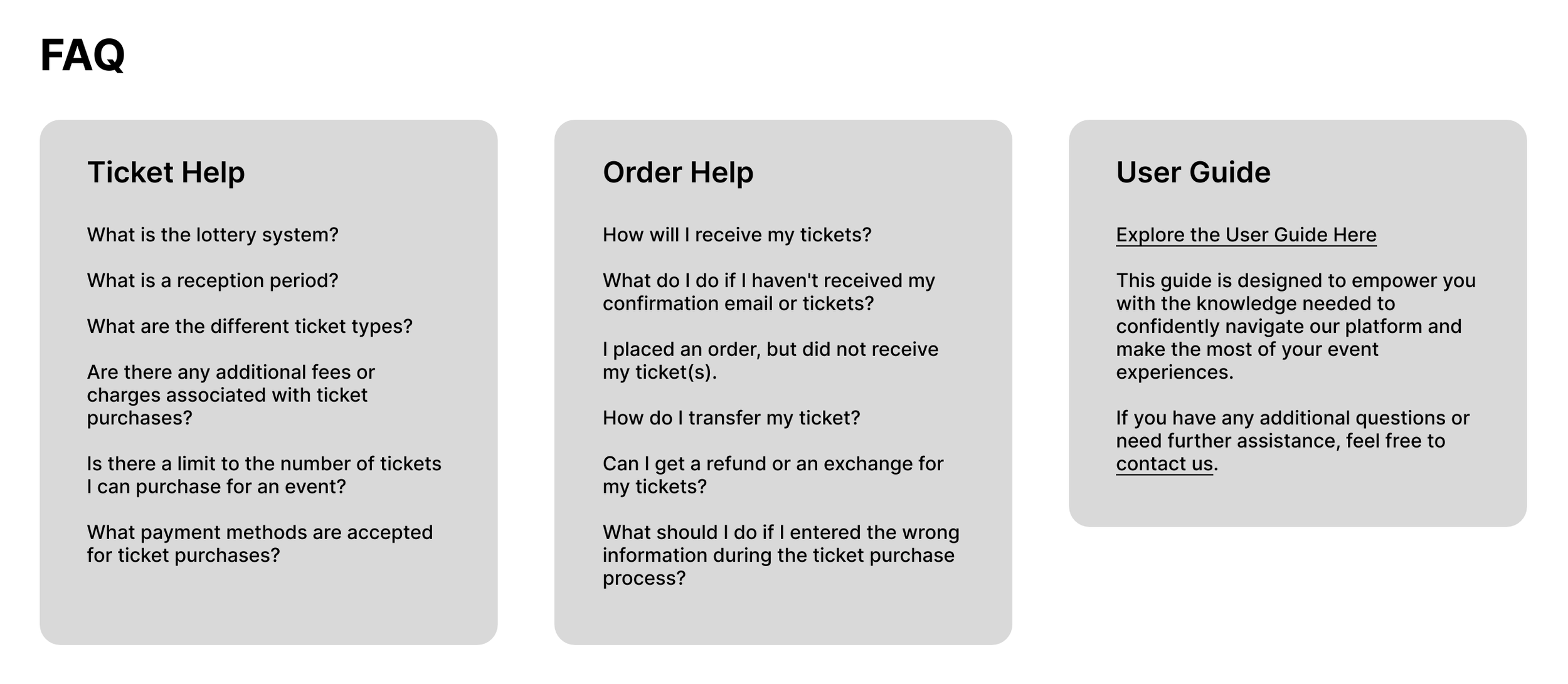
To improve user comprehension, I integrated tooltips next to confusing terms like "Lottery System" and "Reception Period." Users can hover or click on these terms to receive clear, concise explanations without leaving the page, reducing confusion in real time. I also introduced an easily accessible FAQ section addressing common user queries about the ticket purchase process. This section minimizes frustration by providing immediate answers and clarification to typical pain points.
Conclusion & Takeaways
The primary goal of this study was to identify pain points and propose targeted design solutions that enhance eplus’ overall user experience. By focusing on the platform’s event discovery, navigation, and ticket purchasing processes, I aimed to create a more intuitive and enjoyable experience for users. Through user testing and UX principles, my proposed solutions sought to simplify navigation, clarify event details, and streamline the checkout process to reduce user frustration and confusion.
Key findings from user testing revealed several areas needing attention:
Event discovery was hindered by inconsistencies in the design of event cards, making it difficult for users to locate desired events efficiently.
Navigation posed challenges for new users, who struggled to find specific genres or event types.
The ticket purchasing process, although well-intentioned, lacked clarity and overloaded users with complex information, especially around the lottery system and ticket types.
To address these issues, I proposed a range of design solutions:
Standardizing event card layouts to provide clear, consistent information.
Simplifying the navigation structure by introducing dropdown menus and reducing unnecessary buttons.
Enhancing the checkout process with a more organized layout, tooltips, and a clear visual hierarchy, ensuring users can easily navigate each step of the purchase.
In conclusion, this case study outlines a pathway toward a more user-centric eplus platform. By addressing the identified pain points and implementing thoughtful design changes, eplus has the potential to offer a smoother, more engaging experience that continues to solidify its role as a leading entertainment platform in Japan.
For a more in-depth look into this case study, including detailed testing procedures, participant feedback, and data analysis, please refer to the full project report.


