Jumpstarting JamSphere:
Designing a New Music Sharing Platform for Engaging User Experiences
Project Overview
-
Overview
JamSphere is a virtual music-sharing platform designed to connect users through live events, curated playlists, and interactive features. The platform allows users to discover new music, engage with artists and fellow fans, and vote on songs during live events.
-
My Role
I led the end-to-end UI/UX design process, including research, wireframing, prototyping, and usability testing. My focus was on creating an engaging and intuitive experience for users looking to interact with live music events and subscription-based content.
-
Problem
Many music platforms focus solely on streaming, lacking interactive social features that enhance engagement during live events. Users need a way to actively participate in music discovery and event experiences rather than passively consuming content.
-
Outcome
Through user research and iterative design, I developed a user-friendly platform with clear navigation, engaging social features, and a refined subscription model. Usability testing helped validate design improvements, leading to a more intuitive experience.
Design Brief
JamSphere is a virtual music sharing platform designed to connect music enthusiasts worldwide. The platform aims to foster community, discovery, and social interaction through live events, personalized recommendations, and interactive features.
The target audience includes music lovers of all ages and preferences who seek a dynamic and engaging online environment for discovering new music and connecting with like-minded individuals.
Style Guide
JamSphere's logo is a distinctive representation of the brand's identity, featuring a sphere depicted with concentric circles. The sphere symbolizes unity and inclusivity within the diverse world of music. The brand name, "JamSphere," dynamically wraps around the upper left arc of the sphere using the Horizon font.
JamSphere’s messaging is energetic and enthusiastic, capturing the excitement of live music and discovery. It fosters an inclusive, welcoming community while maintaining authenticity and transparency to build trust with users, especially around subscriptions and communication.
JamSphere's color palette creates a vibrant, dynamic atmosphere with Resolution Blue (19297C) and Pink Pizzazz (F65BE3) against a black backdrop, evoking creativity and luxury. The dark theme minimizes eye strain for long sessions, while the bold accents guide users and emphasize key features. This palette ensures a visually engaging, user-friendly, and immersive experience, reinforcing JamSphere’s distinct identity.
JamSphere’s messaging is energetic and enthusiastic, capturing the excitement of live music and discovery. It fosters an inclusive, welcoming community while maintaining authenticity and transparency to build trust with users, especially around subscriptions and communication.
Wireframes
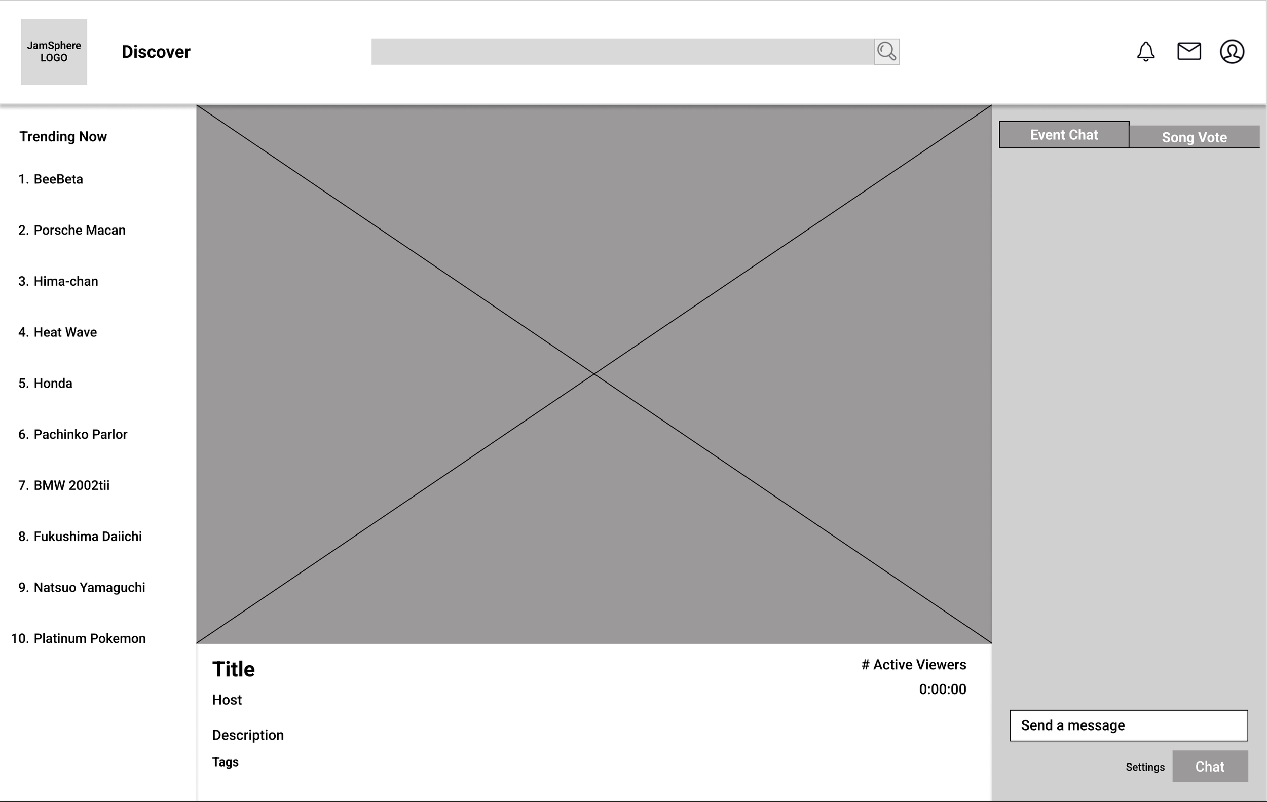
The following wireframes outline the key pages designed for JamSphere, showcasing the platform's user experience and interface.
Each wireframe reflects a deliberate focus on usability, clean navigation, and engaging visual elements tailored to enhance the user journey in the platform.
Initial Prototype
The first iteration of the prototype was designed based on research and best UX practices. Key design choices included:
A dark theme for an immersive experience
Clear call-to-action buttons for discovering events and subscribing
Interactive elements like live chat and song voting to foster community engagement
Usability Testing
A usability test was conducted using a Google Forms survey, where users provided feedback on navigation, clarity, and engagement.
Key Findings
Membership Plans Were Hard to Find
3 out of 5 participants rated ease of finding membership plans as 3 or lower.
Users Found Some Elements Distracting
Some participants struggled to complete tasks due to visual distractions.
Confusion About the Membership Plans
The wording on the subscription page was unclear, with 3 out of 5 users expressing some level of confusion.
Checkout Process Lacked Clarity
Users felt uncertain after completing a purchase due to the absence of a confirmation page.
Revised Prototype
Based on usability testing insights, the following improvements were made:
1. Added a Confirmation Page After Checkout
Users now receive clear feedback that their purchase was successful, reducing uncertainty.
2. Simplified Wording and Made the Membership Plan Page More Engaging
Adjusted the language to be more concise and user-friendly while enhancing the visual appeal.
3. Made Membership Plans Easier to Find
Improved navigation and placed the membership section in a more prominent location.
Conclusion & Takeaways
This project reinforced the importance of iterative design and user feedback in crafting an engaging and intuitive experience. By integrating social features and refining usability, JamSphere now offers a more seamless platform for music discovery and live event participation.
Key takeaways:
Clarity is key – Users need simple and direct information, especially for subscription models.
Engagement features enhance retention – Live chat and song voting added value to the user experience
Testing and iteration drive improvement – The usability study helped pinpoint pain points that were effectively addressed in the revised prototype.
Next steps would include further refining the interactive prototype, incorporating additional user feedback, and translating into mobile.


