Refining Rakuten:
Conducting a Usability Study to Improve E-commerce Metrics
Project Overview
-
✺ Objective
This usability study aimed to assess and enhance Rakuten’s product pages. By identifying usability issues and analyzing user interactions, the goal was to refine the interface and optimize the shopping experience for Rakuten’s customers.
-
✺ My Role
In this project, I conducted remote usability testing via screen-sharing to observe participant interactions and gather feedback. I analyzed usability issues, synthesized findings, and provided recommendations to enhance the Rakuten product page interface.
-
✺ Outcome
The usability study identified key improvements for Rakuten’s product pages, including layout simplification, content clarity, and purchase motivation. These insights provide a roadmap for enhancing the user experience and boosting customer satisfaction if implemented.
Background
Rakuten is a leading Japanese e-commerce platform that offers a wide range of products, including electronics, clothing, and household goods. Known for its extensive selection and competitive pricing, Rakuten attracts millions of users seeking convenient online shopping experiences.
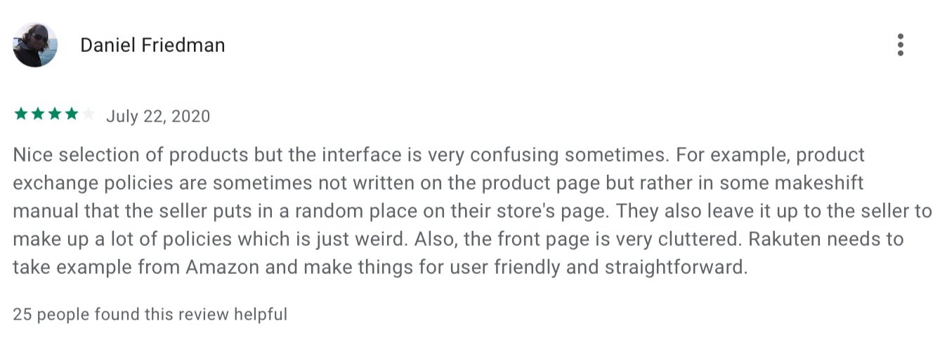
However, despite its popularity, users have reported challenges with navigating product pages, finding relevant information, and completing purchases efficiently. Common issues include cluttered layouts, unclear product details, and a complex checkout process.
Usability Testing
To enhance the overall shopping experience, a usability study was conducted to identify these pain points and provide actionable recommendations for improving the design of Rakuten’s product pages.
The goal is to create a more user-friendly interface that aligns with customer needs and expectations, ultimately driving higher engagement and satisfaction.
Meet the Participants
Methodology
The usability tests focused on task-based scenarios aimed at gathering key metrics. Participants completed tasks that evaluated the ease of navigating product detail pages and provided feedback on the overall design. This provided an opportunity to capture valuable data on user performance and identify areas for improvement.
Key Findings
Product Search:
5 participants had full success in navigating the product pages; 2 had partial success.
Page Design:
Layout and visual design received mixed reviews, with an average rating of 3.7.
Product Details:
Content clarity rated at 4.2 but was described as overwhelming by some users.
Purchase Push:
Motivation to purchase averaged 3.9, but some users hesitated due to cluttered layouts.
Now, let’s take a closer look at the qualitative feedback from the study.
Particpant Comments

"The layout feels a bit cluttered."
"The descriptions are very detailed."
"Specifications are useful but hard to find"
"There's a lot of info, which can be overwhelming ."
Recommendations
Based on user feedback and performance metrics, the following recommendations aim to enhance the usability and effectiveness of Rakuten's product detail pages.
Improve Layout and Visual Design
Simplify the Layout:
Reduce clutter by eliminating unnecessary elements and whitespace. Focus on a clean design that highlights key information, making it easier for users to find what they need quickly.
Enhance Visual Hierarchy:
Use contrasting colors, font sizes, and spacing to create a clear visual hierarchy. Important information, such as pricing and key features, should stand out more prominently.
Intuitive Navigation:
Revamp the navigation structure to make it more intuitive. Consider a breadcrumb trail or clearer category labels that help users understand their path within the site.
Enhance Content Clarity
Streamline Information Presentation:
Organize product details into digestible sections. Use bullet points for specifications, and include clear headings for different content areas (e.g., product description, user reviews).
Highlight Key Features:
Present critical product information at the top of the page or in a prominent section, so users can quickly see what’s essential without scrolling excessively.
Consistent Formatting:
Ensure that all product information follows a consistent format. This helps users know what to expect and makes the content easier to process.
Increase Purchase Motivation
Concise and Persuasive Content:
Revise product descriptions to be concise while still informative. Use persuasive language that highlights benefits and unique selling points, focusing on what sets the product apart.
Clear Call to Action:
Ensure that the “Add to Cart” button is clearly visible and stands out on the page. Use action-oriented language and make the button prominent to drive engagement.
Trust-Building Elements:
Incorporate user reviews and ratings prominently on the product page. Consider using verified buyer badges or highlighting top reviews to build trust and encourage purchases.
Conclusion & Takeaways
The primary goal of this usability study was to identify key pain points within Rakuten's product detail pages and propose targeted design improvements that enhance the overall user experience. By examining user interactions and feedback, I aimed to create a more intuitive and efficient shopping process for customers.
Key findings from user testing highlighted several areas requiring attention:
Users encountered difficulties navigating product categories, leading to frustration in finding specific items.
The layout and visual design of product pages were often perceived as cluttered, making it hard for users to focus on essential information.
Content clarity was inconsistent, with some users feeling overwhelmed by excessive details, which hindered their ability to make informed purchasing decisions.
To address these challenges, I proposed a series of design recommendations:
Simplifying the product page layout to reduce visual clutter and enhance focus on key details.
Improving navigation structures with clearer category labels and intuitive menus to facilitate easier access to products.
Streamlining content presentation to ensure essential information is highlighted and easy to digest, ultimately building user confidence in their purchasing decisions.
In conclusion, this case study outlines a pathway toward a more user-centric eplus platform. By addressing the identified pain points and implementing thoughtful design changes, eplus has the potential to offer a smoother, more engaging experience that continues to solidify its role as a leading entertainment platform in Japan.
For a more in-depth look into this case study, including detailed testing procedures, participant feedback, and data analysis, please refer to the full project report.


