Revamping Yahoo! Japan:
Crafting a User-Centric Experience for Japanese Audiences
Project Overview
-
✺ Objective
My goal was to redesign the Yahoo! Japan website to enhance the user experience for Japanese audiences by modernizing the interface and improving usability to meet contemporary web standards.
-
✺ My Role
I took on the role of the sole designer, responsible for the end-to-end UX. My responsibilities included defining the problem, conducting user research, creating wireframes, developing a prototype, and delivering a project presentation.
-
✺ Outcome
The redesign resulted in a more intuitive and user-friendly Yahoo! Japan, significantly improving navigation and user engagement. The new design better aligned with the preferences of Japanese users, leading to a more personalized and satisfying user experience.
Background
Yahoo! Japan is Japan’s most visited website portal and is home to hundreds of services such as:
Yahoo! Japan Mail
Ymobile
Yahoo! Japan Auctions
Yahoo! Japan Finance
Yahoo! Japan News
Due to the wide range of services offered, Yahoo! Japan is visited by 20 million PC users every month, beating the world renowned competitor, Google.
Let’s examine the current layout and design of
Yahoo! Japan...
Although Yahoo! Japan enjoys widespread popularity as the most frequently visited website in Japan, it is equally renowned for its dated and cluttered interface.
Usability Review
Accumulated Content:
Yahoo! Japan had a vast amount of content and features creating a cluttered user interface.
Ad Overload:
As a major online portal, the website hosts numerous advertisements, adding to a cluttered appearance.
Legacy Design:
Being one of the oldest websites in Japan, Yahoo! Japan's design has not kept up with modern UI trends.
Complex Navigation:
The website has many sections and sub-sections, leading to a complex and confusing navigation experience.
Redesign Goals
Streamlined Interface:
Simplify the design by removing unnecessary elements and reducing visual clutter, creating a clean look.
Improved Navigation:
Rethink the website's navigation structure to make it more intuitive and user-friendly.
Visual Hierarchy:
Implement a clear visual hierarchy to emphasize essential content and guide users' attention.
Personalization:
Introduce personalized content recommendations and user settings to enhance the user experience.
Design Process
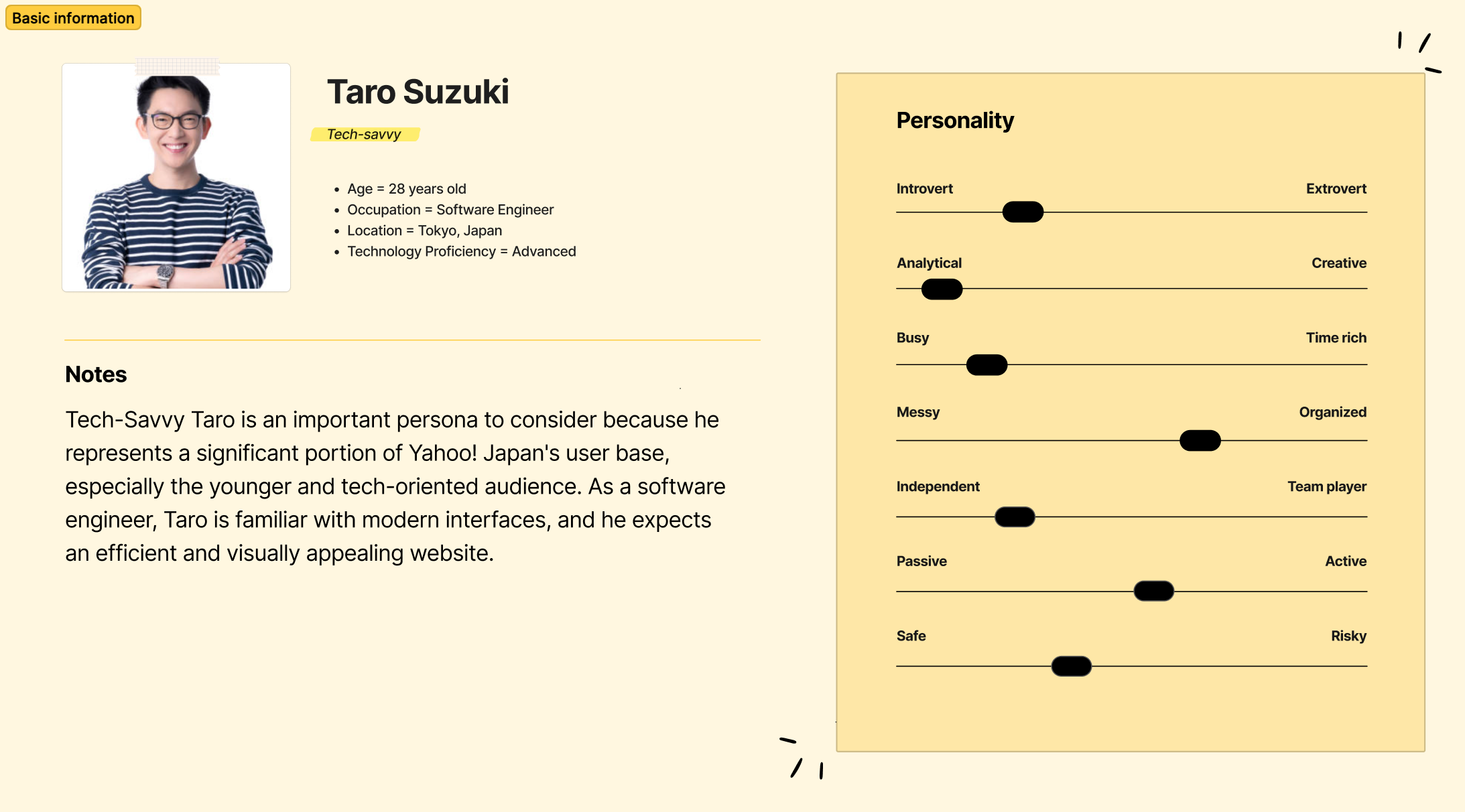
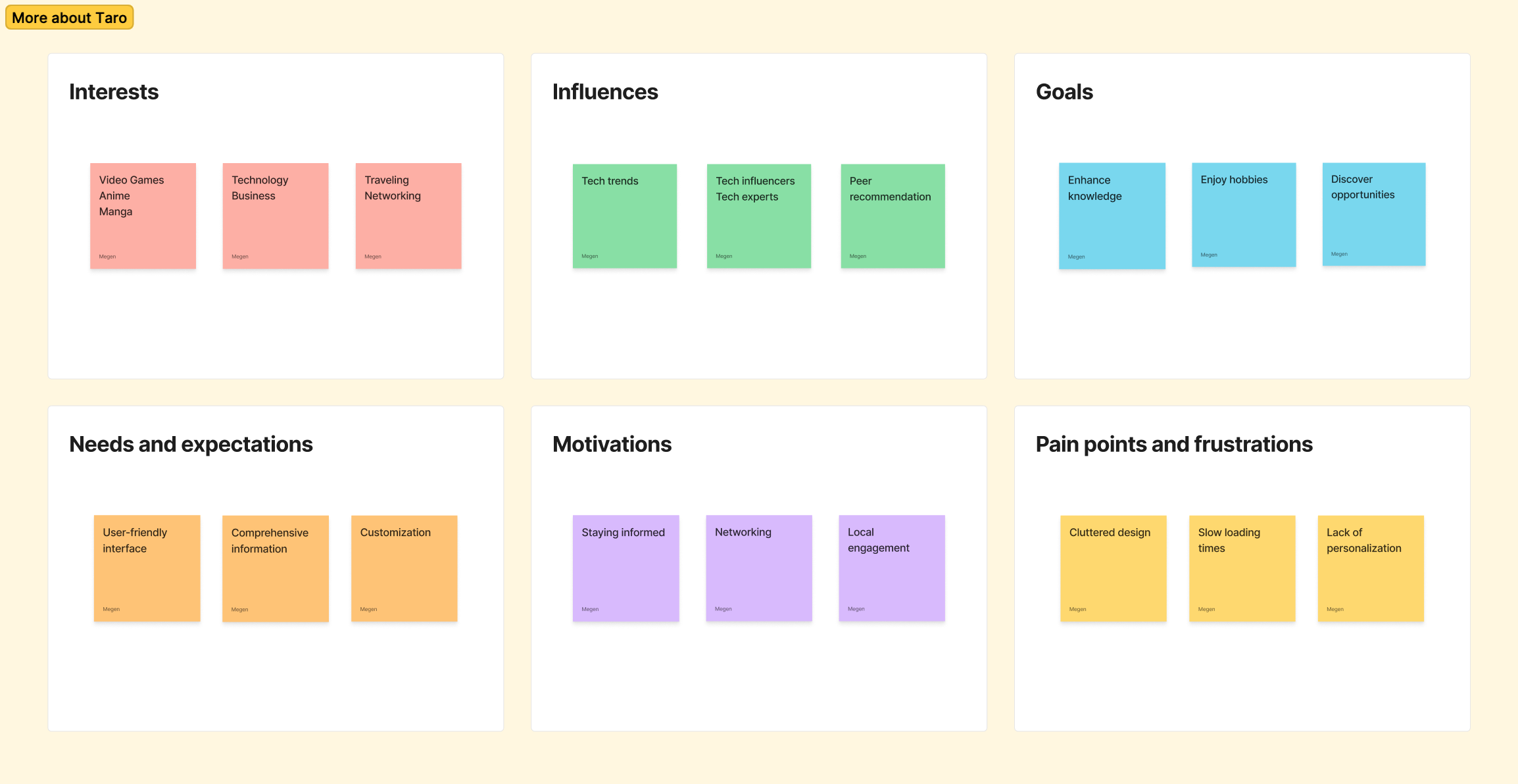
User Persona


Storyboard
Taro has just finished a busy day at work and wants to catch up on the latest technology news and events happening in Tokyo this weekend. He visits Yahoo! Japan's website, looking for a tech news section and a comprehensive events list. However, he feels overwhelmed by the cluttered layout and outdated design, making it challenging to find the information he seeks quickly.
Let’s see what Taro thinks about a redesigned Yahoo! Japan...
Wireframes & Prototype
Keeping in mind Taro’s needs and expectations, the wireframes will apply the following design principles:
Balance: Distribute visual elements to create harmony
Contrast: Add visual interest and guide user attention
Hierarchy: Help users understand importance and flow of content
Alignment: Make design more readable and structured
Consistency: Make design more cohesive and polished
User-centered design: Place the user at the center of the design process
With the use of wireframes, the fundamental structure and layout of the design is established.
However, to bring the design to life and truly understand the user experience, it is necessary to go beyond static representations.
Let’s take a look at how the wireframe concepts have evolved to a more interactive experience with the prototype...
Key Features
Fixed Navigation Bar:
The top navigation bar is fixed in its location so that the user can access its components no matter how far they scroll down the page
Drop-down List to Sort Content:
User can sort content due to most relevance, most recent, most viewed, most commented, and most shared
Easy Access to Home Page:
In the current implemented design of Yahoo! Japan, access to the home page changes depending on where the user ventures within the site. For this redesign, the home page can be accessed by clicking the logo in the top navigation bar from every page.
Conclusion & Takeaways
The primary goal of this redesign was to simplify and streamline the platform, ensuring that users can access information quickly and efficiently. By identifying key pain points through user research and applying UX principles, I aimed to enhance the site's usability while maintaining its comprehensive range of services. This included addressing issues with content overload, navigation inefficiencies, and a lack of visual hierarchy.
User testing highlighted several key areas of concern:
Content overload made it difficult for users to focus on important information, as the homepage was filled with too many elements vying for attention.
The navigation system was cluttered, making it hard for users to find specific features or services.
The lack of a clear visual hierarchy left users confused about where to start, leading to inefficiency and frustration.
To solve these challenges, I proposed a series of design improvements:
Simplifying the interface by reducing visual clutter and organizing content into clearer, digestible sections.
Streamlining navigation by improving the structure and flow, making it easier for users to locate desired content.
Introducing a stronger visual hierarchy to guide users' attention toward key areas of interest and action.
In conclusion, this case study outlines a vision for a more intuitive, efficient, and user-friendly Yahoo! Japan. By reducing content overload, optimizing navigation, and enhancing the site's visual structure, the platform can provide users with a more streamlined and enjoyable experience, while retaining its role as a comprehensive digital hub for millions of users in Japan.


